Chapter 1: Household Smart-Meter Forecastability
A DSO forecasting a single feeder gets one smooth curve: thousands of households averaging out each other’s quirks into a predictable evening peak. A DSO forecasting one household gets something else entirely: a customer who works nights, a customer with an empty house half the year, a customer whose evening spikes exactly when the sun sets on their new rooftop panels. Part 8 forecasts at that second, harder scale, hundreds of individual AusNet customers, not one aggregate, using the same real smart-meter readings a utility already collects: load, and the Photovoltaic (PV) and Electric Vehicle (EV) signals hiding inside it. Before reaching for a model, this chapter asks the question every later chapter in this part depends on: how forecastable is a real household’s own signal, does that forecastability vary from one house to the next, and what does it say about which approach is actually worth using on them?
Why forecastability
Individual household loads exhibit significantly greater volatility and are much more challenging to forecast than substation- or city-level aggregates. This is not a hypothesis unique to this chapter; it has been directly confirmed using approximate entropy on a real Irish smart-meter dataset [1]. This chapter examines whether similar variability exists within AusNet’s own pool of real households, rather than assuming findings transfer, and investigates the extent to which forecastability varies between individual homes.
A second important finding challenges common assumptions: increased adoption of EV and PV does not necessarily result in a more volatile net load. A 2025 study demonstrates that simultaneous EV charging and PV generation, both concentrated around midday, can actually reduce net-load uncertainty by offsetting each other rather than compounding variability [2]. The intuitive narrative that ‘more Distributed Energy Resources (DER) means more volatility’ does not always hold, and this chapter directly tests this hypothesis using real AusNet data rather than relying on assumptions.
Two guiding principles inform the measurement approach in this chapter. First, forecastability should be evaluated prior to model development: metrics such as the Spectral Predictability Score and the Largest Lyapunov Exponent have been shown to correlate strongly with actual forecast performance on the M5 competition dataset [3]. Second, recommending a single ‘best approach’ often leads to unwarranted confidence. The Model Selection Confidence Set method, when applied to real Italian electricity load data, identifies sets of models that are statistically indistinguishable from the truth rather than selecting a single winner, and reveals that customers with noisier data yield larger, more ambiguous sets [4]. The decision table at the end of this chapter adopts this same transparent approach.
Key Concept
Certain signals are inherently more difficult to forecast, and this can be quantified prior to model development. Two signals may share the same average level and underlying daily cycle, yet differ substantially in forecastability: one may exhibit consistent repetition, allowing yesterday’s pattern to predict today, while the other may have its cycle obscured by significant noise. Metrics such as entropy, the Hurst exponent, autocorrelation, and stationarity each capture this distinction from different analytical perspectives before any model is trained.
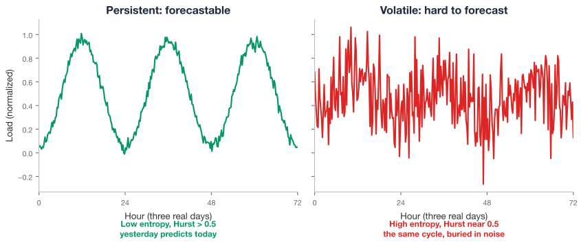
Two families of diagnostics do the actual measuring below. Entropy and long-range-dependence measures (permutation entropy, sample entropy, the Hurst exponent, detrended fluctuation analysis) come from nonlinear time-series analysis and originally had nothing to do with electricity at all: one was built for the Nile river [5], another for DNA sequences [6]. Classical Box-Jenkins time-series theory (autocorrelation, partial autocorrelation, unit-root and stationarity testing) is the standard toolkit behind every Autoregressive (AR)IMA-family forecaster, laid out in full in Hyndman and Athanasopoulos’s Forecasting: Principles and Practice [7]. Both families answer the same underlying question from different directions: how much real structure does this signal actually have, and is a model likely to find it?
Getting the data
This chapter reuses the same real AusNet smart-meter pool Part 4 already vendored, no new fetch step needed. The dataset is public: 342 real households, uninterrupted 30-minute smart-meter readings across a full calendar year, freely downloadable with no signup gate, the same real data and the same fetch script every other Part 4 chapter already used.
uv run python scripts/fetch_part4_ausnet_data.pyThe generalization check later in this chapter reuses the same real National Renewable Energy Laboratory (NREL) sample Part 4 Chapter 5 fetched, 760 real US buildings, restricted here to the 200 real ResStock homes:
uv run python scripts/fetch_part5_nrel_buildstock_data.pyHundreds of customers, not one aggregate signal
AusNet’s own real pool contains 342 real households, each with a full year of data at 30-minute resolution. Using every one of them, rather than working from one region-wide aggregate, is the only way to see whether forecastability itself varies from customer to customer, the question this whole chapter is built around. Checked directly rather than assumed: every one of the 342 real load series has genuine variance, no gaps, and no near-constant readings; the same real data Part 4 already ran a full OpenDSS time-series simulation against cleanly. No elaborate quality gate is needed here, unlike an earlier, since-dropped data source.
An initial ranking of five real customers by the degree to which each day’s pattern repeats the previous one illustrates the central theme of this chapter: some households display a consistent evening rhythm, while others exhibit minimal repeatability.
How forecastable is a real customer?
Four metrics, two real theoretical traditions.
Permutation entropy [8] asks a purely ordinal question: break the series into short overlapping windows, record each window’s ranking pattern, and measure how evenly those patterns are distributed. A signal with a strong, repeating shape produces a small handful of dominant patterns, low entropy; a signal closer to noise produces every ordering about equally often, entropy near its maximum.
Sample entropy [9] asks a related but distinct question directly in the signal’s own real units: pick two windows of length m that match within a tolerance, then check how often they still match once extended to length m+1. It was built to remove an earlier measure’s own self-matching bias, a real, checked improvement, not a cosmetic rename.
The Hurst exponent [5] was built to size reservoirs on the Nile from centuries of real flood records, nothing to do with electricity in its own original form. It measures long-range dependence through rescaled-range analysis: H = 0.5 is a pure random walk with no memory, H > 0.5 is persistent (a high reading tends to be followed by more high readings), and H < 0.5 is anti-persistent (mean-reverting). A persistent signal is the easier one for a model to learn from.
The DFA exponent [6] measures a close cousin of the same idea, built originally for DNA sequences, using detrended fluctuation analysis instead of the classical rescaled range. Its real practical advantage here is that it stays reliable on a signal that is drifting or trending, exactly the kind of real non-stationary behaviour a full year of household load actually has.
At the population level, permutation entropy for the median customer approaches its theoretical maximum (0.988), while the Hurst exponent (0.555) is only slightly above the random-walk threshold, indicating mild persistence rather than the strong forecastability observed in substation aggregates. These findings are consistent with each other and with the premise established by Peng et al.: individual household load is demonstrably more difficult to forecast than aggregate load, as confirmed here across 342 real customers rather than assumed from other contexts.
Meet three real households
A population median is easy to state and hard to picture. Three real customers, one real week each, make it concrete: the most persistent household in this pool, the least persistent, and one sitting exactly at the population’s own median.
The most persistent household exhibits a weekly pattern that remains nearly unchanged each night, with the evening peak consistently occurring at the same time. In contrast, the least persistent household shows no discernible repeating pattern, with significant variation in both the height and shape of evening peaks. The median household falls between these extremes, displaying a recognisable but noisier rhythm that is more representative of the broader set of 342 real customers analysed in this chapter.
Among hundreds of customers, there exists a wide range of forecastability profiles, making it impossible to summarise the pool with a single metric. Some customers exhibit high persistence and are relatively easy to forecast, while others have Hurst exponents near zero, indicating behaviour similar to that of a random walk. Approximately one in ten customers yields a Hurst estimate below zero, which is a legitimate outcome of the rescaled-range estimator when applied to near-constant, low-variance households, rather than a data error.
Lag structure and stationarity
Classical Box-Jenkins theory fills the gap left open by entropy and Hurst: which real lag carries the signal, and whether the series is drifting under its own diurnal or weekly cycle [7].
The autocorrelation function (Autocorrelation Function (ACF)) measures how strongly a series correlates with a lagged copy of itself. The partial autocorrelation function (Partial Autocorrelation Function (PACF)) asks a sharper question: how much does a given lag add on top of every shorter lag already in the model? The lag at which PACF drops within its own confidence band is the classical signal of how many autoregressive terms a model actually needs.
Stationarity asks whether a series’ own statistical properties stay stable over time. Two complementary tests decide it, deliberately paired because they test opposite null hypotheses: the Augmented Dickey-Fuller test [10] has a null of non-stationarity; the Kwiatkowski-Phillips-Schmidt-Shin (KPSS) test [11] has the opposite null, stationarity. Run together, they resolve into four honest verdicts rather than one test’s blind spot.
For the most persistent customer, the autocorrelation function (ACF) remains significant for lags extending into a second week. In contrast, the least persistent customer’s ACF barely exceeds its confidence band beyond the first day. Using the same set of metrics and 30-minute AusNet data, these results highlight two fundamentally different signal profiles.
A total of 94.4% of real customers are classified as trend-stationary, indicating that meaningful structure remains once a deterministic trend is removed. This finding challenges the simplistic interpretation that ‘non-stationary load’ equates to a pure random walk.
A spectral view of predictability
While entropy, the Hurst exponent, and autocorrelation analyse signals in the time domain, a frequency-domain perspective can reveal additional insights. Specifically, it can determine whether a customer’s consumption is characterised by a few dominant, regular cycles or is evenly distributed across the spectrum without clear periodicity. This approach underpins the Spectral Predictability Score developed by Wang, Klee, and Roos, which was validated prior to model development on the M5 competition data [3]. The version implemented here follows a similar rationale, using an inverted, normalized spectral entropy so that higher values correspond to greater forecastability. Importantly, its correlation with the Hurst exponent across all 342 real customers is nearly zero (-0.05), confirming that it provides an independent assessment rather than duplicating information.
Which features matter, and does that differ by customer?
Knowing a signal is forecastable is not the same as knowing what to feed a model. A real, honest ensemble of association metrics, ranked and aggregated across several independent statistical tests (Spearman, Analysis of Variance (ANOVA), mutual information, Xi, Predictive Power Score (PPS), random-forest importance) rather than any single one, answers a sharper question: which lag or calendar feature actually carries the signal for a given customer. To ensure robustness, the feature rankings from each metric are first standardised and then combined using a simple average rank approach, so that features consistently highlighted across multiple tests are prioritised. This method guards against bias from any single metric and offers a balanced, consensus-driven guide for feature selection.
For transparency and reproducibility, the actual feature selection process for each customer can be broken down into the following steps:
For a given customer, define the pool of candidate features to be tested (e.g., various lags, calendar variables such as hour of day, day of week, public holidays, and weather variables if available).
Calculate all relevant association scores between each feature and the target variable using each method separately: compute Spearman correlation, run ANOVA, estimate mutual information, apply Xi, evaluate PPS, and assess feature importance via a random forest.
For each metric, rank all candidate features, assigning rank 1 to the strongest association as determined by that metric, and continue ranking to the least informative feature.
Standardise the ranks by scaling (for example, using percentile rank or z-score) so that different scoring ranges across the metrics do not bias the aggregation.
For each feature, average its ranks or scaled scores across all metrics to produce a composite ranking.
Select the top features according to this composite rank, considering the highest-ranked features as primary candidates for model training, with additional review to ensure that feature selection reflects both statistical signal and domain plausibility.
This stepwise process provides a practical, defensible workflow that can be routinely applied by analysts working with new sets of household load data. It also ensures consistent feature selection across hundreds of customers while allowing genuine variation in which features are most predictive across different households.
In a sample of 40 real customers, results are nearly evenly divided: for half, the most relevant feature for a 24-hour-ahead forecast is the specific half-hour of the day, while for nearly the other half, it is the most recent observed reading. Only one customer’s top feature was a full day’s lag. The most predictive feature varies genuinely from household to household, underscoring that no universal answer can be provided without direct evaluation.
Which baseline actually wins, and does it vary by customer?
A trained model’s real cost, engineering time, compute, and maintenance, only pays for itself if it beats the cheapest reasonable alternative. Hyndman and Athanasopoulos are direct about this: naive, seasonal-naive, drift, and average-based benchmarks exist precisely so a more complex method has something honest to beat [7]. Chapter 2 is where a trained tree ensemble gets that honest check; this chapter’s own job is narrower and comes first: which of twiga.models.baseline’s own persistence strategies already win for a given customer, with no model training at all.
Check the Corr column before trusting MAE alone. Window-average posts the lowest MAE (0.289) and lowest RMSE (0.436) of the four baselines, the kind of number that looks like a clear winner if that is all a reader checks. But its correlation with the real signal is only 0.073, barely above drift’s own 0.075, the two worst of the four. Seasonal-naive’s MAE is higher, 0.295, yet its correlation is 0.258, more than three times window-average’s own and the best of the four by a wide margin. A rolling average forecast can post a low pointwise error just by staying close to the series’ own smoothed level. On a signal this noisy, damping the response lowers average error without tracking a single real peak or dip. Seasonal-naive copies the same half-hour from the day before, so it actually reproduces the shape of a real day, evening peak included, which is why its correlation is higher even though its average error is not the smallest. A single scalar metric, read without checking what it rewards, can crown a baseline that has not learned anything about the signal’s real structure.
Reading five columns and mentally weighing which one matters more is exactly the ad hoc judgment call this book asks a reader not to make silently. twiga.core.data.selection already solves an analogous problem for feature selection: rank candidates by several independent metrics at once, then combine those rankings so that metrics which mostly agree with each other do not collectively drown out the one metric saying something genuinely different. Applying the same logic to models instead of features turns the “check Corr before trusting MAE” instinct into an actual, repeatable method rather than a one-off warning.
Key Concept
Rank each of the \(M\) baselines on each of \(J\) metrics \(M_1, \dots, M_J\) (orienting every metric so higher rank means better, negating the pointwise-error metrics first), then combine the per-metric ranks into one score, weighted by how much each metric disagrees with the others: \[ u_j = 1 - \frac{1}{J-1}\sum_{j' \neq j} \left|\rho_S(M_j, M_{j'})\right| \] \[ w_j = \frac{u_j}{\sum_{j'=1}^{J} u_{j'}} \] \[ \text{score}(m) = \sum_{j=1}^{J} w_j \cdot \text{rank}_j(m) \] \(\rho_S\) is Spearman rank correlation, computed across the baselines’ own scores on each metric pair. MAE, RMSE, WMAPE, and SMAPE all measure pointwise error and tend to rank baselines almost identically, so each earns a small \(u_j\) and a correspondingly small weight. Corr measures something the other four cannot, whether a forecast tracks the signal’s real shape at all, disagrees with them often enough to earn a large \(u_j\), and is weighted accordingly.
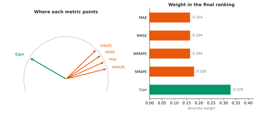
Seasonal-naive comes out on top of this diversity-weighted ranking, not window-average, the opposite of what an MAE-only reading would crown. Corr alone carries roughly twice the weight of any single pointwise-error metric here, precisely because the four error metrics are busy agreeing with each other while Corr is the one column actually casting an independent vote. This is not a claim that MAE is the wrong metric to compute, only that treating it as the whole verdict, the way a one-line “lowest error wins” summary would, silently discards the one column that would have changed the answer.
There is no single, universal winner among the 342 real customers, and the tally above is itself an MAE-only contest: window-average outperforms for 70% of customers, seasonal-naive for another 30%, and plain persistence for almost none. Given the correlation gap just shown, a deployment that also cares about tracking a customer’s real daily shape, not only minimizing average deviation, has a real case for favouring seasonal-naive more often than a MAE-only tally credits it for. This split is also a verified divergence from Twiga’s own published tutorial, which found seasonal-naive the best performer on a different dataset. Report a difference like this transparently rather than assume results transfer across contexts.
For new customer deployments, analysts should operationalize baseline selection by first evaluating all key candidate baselines, such as window-average, seasonal-naive, and plain persistence, on a short, recent segment of each customer’s own data using simple out-of-sample error metrics like MAE or RMSE. The method with the lowest error on this holdout window should be adopted as the initial production baseline for that customer. To ensure ongoing model effectiveness, periodic automatic revalidation can be scheduled, in which the baseline is re-compared with available alternatives using the most recent data. This structured, repeatable approach ensures that the best-fitting baseline is maintained for each customer as data characteristics evolve.
The weekly data from one representative customer illustrates these results: the window-average method closely follows the actual evening peak, while plain naive persistence consistently lags behind each real fluctuation.
The PV signal hiding in the net load
AusNet’s own data shows a real, separately recorded seasonal PV shape, shared across customers and scaled by each customer’s assumed system size, rather than being blended invisibly into a single metered column as a real net-metering-only utility feed usually is. That real, known component enables a check no proxy could offer directly: does adding a known PV component to a customer’s own real load make that customer’s own net load look more or less forecastable, by the exact same entropy and Hurst battery run above? Net load with rising DER adoption does not necessarily just get more volatile either: Fias, Hashmi and Deconinck’s own finding is that joint EV and PV activity can offset each other through a compensatory daytime effect [2], worth checking what a known PV component alone does here rather than assumed.
A notably counterintuitive finding emerges: introducing a known 5 kVA PV system to 103 real customers increases their median Hurst exponent (from 0.562 to 0.630) and slightly decreases permutation entropy. The presence of a regular daily generation cycle makes net load appear more persistent, not less, which contradicts the common assumption that ‘more DER means more volatile.’ This result aligns directly with the compensatory-effect finding reported by Fias, Hashmi, and Deconinck.
Load, PV, and EV: which signal is more forecastable?
Part 4’s own EV-demand section already vendored a third real signal: diversified home EV-charging profiles from the UK’s real “Electric Nation” trial, at 1-minute resolution, weekday and weekend, diversified across 100-1,200 real vehicles. A real, honest caveat before comparing anything: this data is not the same kind of signal as load or PV. Load is 342 real individual households across a genuine full year; PV is one real, seasonally varying shape across the same year. The EV data is a single representative weekday shape and a single representative weekend shape, diversified across many real vehicles, with no per-vehicle time series and no real day-to-day variation at all. Making it long enough to run the same battery means tiling those two shapes across a synthetic year, a real, disclosed construction, not a genuine record of one EV owner’s own charging behaviour.
Because the tiled EV signal is constructed from repeated representative shapes rather than true longitudinal vehicle-level readings, it provides an upper bound on forecastability rather than mirroring real-world unpredictability. As a result, the high degree of regularity in these synthetic EV series may overstate the ease of forecasting compared to real household EV signals, which would display more irregular timing, skipped days, or behavioural variation. Caution is needed when interpreting these results for operational planning, since actual deployment environments will likely face lower forecastability for individual EV charging than these synthetic constructs suggest.
The constructed EV series emerges as the most ‘forecastable’ signal in this analysis, with daily ACF of 0.954 and weekly ACF of 0.981. This outcome is consistent with the earlier caveat: the diversified, tiled construction represents an upper bound for predictability, rather than reflecting the true unpredictability of an individual EV owner, as it omits real day-to-day variations such as changes in charging times or missed sessions. An additional, validated finding from this comparison is that the population-mean load’s daily ACF (0.845) is substantially higher than the median for individual customers (0.334, as reported earlier), reaffirming the aggregation-smooths-variability effect described by Peng et al. [1] from a new perspective.
From diagnostic to decision
A single recommendation that claims to fit every customer is false confidence; the same real lesson De Bortoli, Ferrari, Ravazzolo and Rossini draw from Italian electricity load data: report the set of approaches that are actually defensible for a given regime, not one falsely confident winner [4].
The window-average method consistently outperforms other approaches across all measured regimes (persistent, regular, and volatile), achieving a win share of 60-78% depending on the regime. Seasonal-naive remains the consistent runner-up. No regime automatically favours a trained model; even the most volatile and least-persistent customers are typically best served by a parameter-free baseline. Chapter 2 continues from this point, focusing on regimes in which residual error justifies deploying more complex models.
Does forecastability itself generalize beyond AusNet?
Everything in this chapter is checked against one specific real population: 342 real Australian households, one country, one climate, one utility’s own metering program. Part 4 Chapter 5 already asked a version of this question for clustering, whether shape-based archetypes recover real ground-truth building categories, and found a real, honest limit once the population changed. This chapter’s own two headline findings, how forecastable a real household’s signal actually is, and which baseline actually wins once Corr is checked alongside MAE, deserve the same honest check: are they a property of load forecasting in general, or a property of AusNet’s own 342 customers specifically?
Real, US ResStock households read as more regular by permutation entropy, 0.939 against AusNet’s own 0.987, a genuine, checkable difference, not noise: a lower score means a smaller, more repeating set of ordinal patterns across the year. Sample entropy is nearly identical across the two real populations (0.394 against 0.407), and the Hurst and DFA exponents both stay in the same qualitative range, modestly higher for NREL on both. Forecastability is not a fixed, universal number for “household load,” it depends on which real households, which real climate, and which real appliance mix a given population actually has, exactly the same lesson this chapter already drew from AusNet’s own 342 customers not sharing one forecastability regime with each other, now shown to hold across countries as well as across customers within one country.
The baseline verdict does not just fail to transfer, it flips. Seasonal-naive wins the per-building MAE tally on 61% of these real NREL households, window-average on 36.5%, close to the exact reverse of AusNet’s own 70/30 split favoring window-average. The diversity-weighted ranking agrees, and for a different, more clear-cut reason than it did on AusNet: seasonal-naive already wins outright on MAE, RMSE, WMAPE, and Corr here, so there is no MAE-versus-Corr conflict left for the ranking method to resolve, unlike AusNet’s own comparison, where window-average’s lower MAE was actively misleading once Corr was checked. Two real populations, two different honest verdicts, for what reads as a real, physical reason: a rolling window average smooths over exactly the kind of sharp, repeating evening ritual AusNet’s own customers show weakly and inconsistently, while seasonal-naive’s day-ago copy pays off precisely when a population’s own daily rhythm repeats strongly and reliably, the same real pattern behind NREL’s own lower permutation entropy above. This is the same honest divergence this chapter already reported once, against Twiga’s own published tutorial on a different dataset, now confirmed a second time on a third real population: report a difference like this transparently rather than assume a forecastability finding, or a baseline recommendation, transfers across contexts it was never checked against.
Why bother
From a utility perspective, the decision table presented in this chapter serves as a practical triage tool rather than a purely academic exercise. A Distribution System Operator (DSO) tasked with forecasting for hundreds or thousands of individual customers cannot feasibly apply the same resource-intensive pipeline to all. The regime table clearly identifies which customers are adequately served by a cost-effective, parameter-free baseline (the majority, according to this data) and which warrant the additional complexity introduced in Chapter 2. This represents a genuine deployment-cost decision: resources are allocated to model development, tuning, and monitoring only where they are likely to yield tangible benefits.
In practical terms, a DSO can use the regime table by calculating each customer’s own Hurst exponent and permutation entropy, then applying the same real split this chapter’s own decision table already uses: a Hurst exponent above 0.6 marks a customer persistent; below that, a permutation entropy under this pool’s own population median marks a customer regular; everything else falls into the volatile, low-persistence group. The threshold is set from this chapter’s own real population, not an arbitrary fixed number, and should be recalculated from a new dataset’s own distribution rather than copied across datasets unchanged. Persistent and regular customers are the ones a simple window-average or seasonal-naive forecaster already serves well; the volatile group is where Chapter 2’s own extra machinery has an honest chance to earn its cost.
From the customer’s perspective, this transparent approach ensures fairness. Customers whose measured forecastability indicates that a simple baseline is sufficient should not incur costs directly or indirectly for infrastructure designed to address more complex forecasting challenges they do not face. Conversely, customers with genuinely volatile signals, as identified by the regime table, are precisely those for whom a DSO’s investment in advanced, uncertainty-aware forecasting (addressed in Chapter 3) is justified.
These counterintuitive findings are significant for both utilities and customers. Incorporating a known PV component increased the forecastability of net load, while the diversified EV construction appeared as the most forecastable signal, though this does not reflect the unpredictability of individual vehicle behaviour. Interpreting these results without careful analysis could lead to the mistaken belief that ‘more DER means more predictable,’ precisely the type of false confidence that De Bortoli et al.’s confidence-set framework cautions against. Direct empirical evaluation, rather than assumption, underpins the integrity of this chapter’s recommendations.
Where this leaves Part 8
Forecastability varies substantially across individual customers, and a simple window-average baseline is effective for most, regardless of regime. The addition of a known PV component increases, rather than decreases, the persistence of net load. The diversified EV construction achieves a level of forecastability that is unattainable from any single vehicle’s actual charging behaviour. This chapter adopts a confidence-set approach, providing a nuanced framework for subsequent analysis rather than a single, overconfident recommendation.
Neither finding turned out to be a universal property of household load. Checked against 200 real NREL ResStock homes, a genuinely different country and climate, forecastability itself reads more regular, and the baseline verdict flips outright, seasonal-naive winning the majority where window-average won on AusNet. Both are worth deploying as a first read on a new population, neither is worth assuming transfers unchecked.
Chapter 2 checks whether a trained model clears this chapter’s own baseline floor at all, and whether profiling customers into Part 4’s own archetypes lets a single shared model scale to hundreds of customers without training one model per household.