342 real AusNet households, a full real year of half-hourly readings eachChapter 3: Customer Clustering Across Three Utilities
Part 4 Chapter 2 plotted a handful of AusNet’s 342 households side by side and made one plain observation: no two profiles agree. Some households barely draw half a kilowatt all day. Others spike past five kilowatts every evening. That chart was true, and also incomplete. A Distribution System Operator (DSO) cannot plan a feeder, price a tariff, or run a demand-response program around 342 individual shapes. It needs a smaller number of recurring patterns underneath that mess, not an average that describes no one.
Chapter 1 named the four questions behind that need. Chapter 2 settled how to answer them without labels: cluster on shape, not magnitude, and validate the result against resampling rather than a single index. Whatever recipe wins still has to check out against more than one population before anyone trusts it. This chapter is where that settled methodology meets AusNet’s customers for the first time. It builds archetypes from AusNet’s year of smart-meter data. It checks whether a customer’s pattern is a stable trait or a one-day snapshot, a question the literature Chapter 1 reviewed never asks. And it tests whether knowing a customer’s pattern predicts anything a DSO would care about. Specifically, which Distributed Energy Resources (DER) constraint, voltage or thermal, a customer’s future Photovoltaic (PV) or Electric Vehicle (EV) adoption is likely to trigger.
Applying a settled methodology, not re-deriving one
Chapter 1 already settled why this is a clustering problem, not a classification one. No utility keeps a ground-truth “true customer type” label, so there is structure to discover here, not a known answer to check against. Part 4 Chapter 3’s phase-identification work had a answer to check its own clustering against. This chapter does not, and leans on the same validity indices and honest sensitivity checks Chapter 1 introduced and Chapter 2 put into practice.
Chapter 1 and Chapter 2 also already settled what “similar” means for a load shape. Every method in this part clusters on peak-normalized shape, not raw magnitude. A small apartment and a large house can then land in the same archetype when their rhythm matches, shown directly in Chapter 1’s figure. Part 4 Chapter 3 used the same principle for a different reason, tracking phase membership through voltage correlation rather than raw voltage. This chapter applies that settled choice. It does not re-derive it.
Chapter 1’s literature review already covers this ground in depth, from McLoughlin, Kwac, and Haben’s early shape-based work through Rajabi’s comparative benchmarking to Michalakopoulos’s explainable clustering and Yerbury’s CROCS. None of that literature asks whether a customer’s archetype holds up across a full year, or only the one window each study clustered on. That gap is what this chapter’s own stability check fills, later on.
Getting the data
This chapter reuses the same AusNet smart-meter pool Part 4 Chapters 1 through 3 already vendored, no new fetch step needed:
uv run python scripts/fetch_part4_ausnet_data.pyA real season, not one day
A single day is a noisy read on anyone’s routine: a sick day, a weekend, a one-off late night. Averaging a customer’s readings across a season smooths that out while staying specific to that customer, not a population average. load_data holds a full year for all 342 AusNet households, 365 days of half-hourly readings each; the clustering input built from it below is a 2-dimensional PaCMAP embedding, not the raw readings themselves.
A search, not an assumption
Chapter 2 did not just settle a methodology in the abstract; it also built a genuine search mechanism, an Optuna multi-objective sweep across feature set, scaler, dimension-reduction technique, and clusterer, and proved it on London. That mechanism has since been extracted into a reusable module, ark.cluster.search, precisely so a later chapter does not have to choose between assuming Chapter 2’s recipe travels unchanged or re-deriving a search from scratch. This chapter runs that same search directly on AusNet’s full year of data, letting AusNet’s population pick its own best combination rather than inheriting London’s.
The search itself checks the same combination of cheap indices McLoughlin et al. and Rajabi et al. recommend, the elbow method on inertia, the silhouette coefficient, and the Davies-Bouldin index, across every candidate it tries [1], [2], but treats none of them as the final word. AusNet’s winner: the profile feature set (weekly and seasonal hour-of-day averages, built from the full year, not a single 90-day slice), a robust scaler, PaCMAP, and k-means.
Silhouette alone peaks at \(k=2\) (0.534), dips through \(k=5\) (0.423), then recovers partway back up through \(k=8\) (0.435), not a clean monotonic decay. Calinski-Harabasz shows the same wobble, \(k=8\)’s 676.7 actually higher than \(k=2\)’s 659.2. A weighted Borda rank across all four cheap indices at once, ark.cluster.cluster_validation.recommend_k with strategy="rank", agrees with that read directly rather than leaving it to eyeballing a table.
\(k=8\), \(k=9\), and \(k=3\) all land within a point of each other on the weighted Borda score (5.879, 5.782, 5.758), \(k=2\) trailing at 5.104. Read on separation and rank alone, \(k=8\) is a genuine, established-method recommendation, not a cherry-picked outlier. The question is not where a separation metric or a rank aggregate peaks. It is which \(k\), if any, survives resampling.
\(k=3\) wins the composite ranking outright, 0.883 against \(k=2\)’s own 0.857, prediction strength 0.886, minimum cluster stability 0.962, both comfortably inside Tibshirani and Walther’s and Hennig’s trustworthy ranges. \(k=8\)’s separation and rank-based recommendation does not survive contact with resampling: prediction strength 0.514, barely half of \(k=3\)’s 0.886 and far under Tibshirani and Walther’s 0.8 floor, a concrete instance of the same lesson Chapter 2’s fANOVA decomposition already found in the abstract, that \(k\) dominates whether a clustering is trustworthy far more than it dominates how separated it looks or how a rank aggregate scores it. Every other \(k\) from 4 to 9 falls away just as sharply, prediction strength never exceeding 0.630 and stability never exceeding 0.805.
This chapter builds on \(k=3\) from here on, the resampling- trustworthy top answer, checked directly rather than assumed. \(k=8\) is not discarded, though: it is a genuine, differently-validated candidate, worth showing honestly rather than only the one this chapter ultimately commits to, the same landscape-not-winner discipline Chapter 2 already applies to London.
Three archetypes, 146, 84, and 112 households, visibly separated in the same PaCMAP space the search itself found, not a projection built after the fact.
Eight visually distinct rhythms against three broader ones, the same 342 households read at a finer resolution. Neither reading is wrong. \(k=3\) is the one this chapter can vouch for under resampling; \(k=8\) is the one a reader wanting more operational granularity, and willing to accept an unquantified resampling risk in exchange, might reach for instead.
Does the clustering algorithm matter here too?
Part 5 Chapter 2 found that k-means, Gaussian mixture, and agglomerative clustering return the identical partition once feature, scaler, and reducer are already fixed, checked at two conditions there, the settled recipe’s point and the strongest \(k=4\) alternative from the same search, not just one operating point. That same two-condition discipline applies here: does clusterer choice matter at the trust-gated \(k=3\), and separately, at the rank-based \(k=8\)?
At \(k=3\), the clusterer choice is not entirely free. k-means and Gaussian mixture come close, nearly identical silhouette (0.487 against 0.490) and balance (0.977 against 0.954), with a decent agreement (Adjusted Rand Index 0.842). Agglomerative clustering diverges a little more (Adjusted Rand Index 0.742). At \(k=8\), agreement is weaker still: Gaussian mixture and agglomerative clustering both fall to an Adjusted Rand Index of 0.667-0.668 against k-means, a disclosed cost of the richer resolution beyond its own weaker resampling numbers. A finer split does not only cost trust; it also costs algorithm agreement. k-means remains this chapter’s reasonable choice at either resolution, not because the others fail, but because none of them earns a reason to switch.
How much does that overlap actually matter?
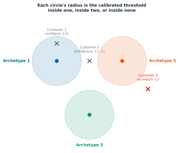
“Some overlap” is a qualitative read on a chart. Turning it into a number a DSO could actually use borrows a tool Part 4 Chapter 3 already built: split conformal prediction. There, it checked phase assignments against a known answer, flagging which customers’ labels deserved a second look. This chapter has no known answer to check against, but the same tool still works, aimed at a different question: not “is this label correct,” but “how many archetypes could this customer plausibly belong to.”
The method fits k-means on part of the customers and holds the rest back. For each held-back customer, it measures the distance from that customer’s profile to its own nearest cluster centroid, a checkable number for every customer, not just the ones near a boundary. The held- back customers’ distances pick a threshold, the value 90% of them fall under. Any customer, old or new, then gets a prediction set, not a single label: every archetype whose centroid sits within that same threshold.
Calibrated on 103 held-back customers, the threshold sits at 2.557. Most customers, 310 of 342 (91%), get an unambiguous, single-archetype set, a consequence of three more separated archetypes leaving less room for ambiguity than a richer, more overlapping split would. Twelve customers (4%) get two plausible archetypes. Twenty customers (6%) get an empty set: their own best-matching archetype still sits farther from its centroid than 90% of the held-back customers ever did, households whose behavior does not confidently match any of the three archetypes.
Key Concept
This is the same split conformal machinery Part 4 Chapter 3 used, aimed at a different job. There, it flagged phase assignments worth a second look against a known answer. Here, with no known answer to check against, it still earns its keep: it turns “some of these archetypes overlap,” a read on a chart, into a checkable, per-customer confidence set. A DSO deciding how much to trust an archetype-based connection or tariff decision now has a number to weigh that decision against.
Does a more advanced method earn its complexity?
IDEC, Improved Deep Embedded Clustering, pretrains an autoencoder, then jointly optimizes a reconstruction loss and a clustering loss, in principle learning a representation shaped for clustering rather than clustering whatever k-means is handed [3]. Kumar and Mallipeddi apply the same idea to load-pattern segmentation directly, confirming that lineage is still active [4]. Worth testing on this exact data before assuming it helps.
Common Mistake
IDEC underperforms plain k-means at every k tested, and the gap widens as k grows. This is not a bug. It is what happens when a deep method meets data too small and low-dimensional to need it: 342 customers, 48 features, is not enough for an autoencoder’s extra representational flexibility to earn its own complexity over a much simpler method already finding the same structure. The lesson is not “IDEC is bad.” It is that a more advanced method has to prove itself on the data actually in hand, not get credited for sophistication it does not need here.
Are these archetypes stable, or a snapshot artifact?
None of this chapter’s ten reference papers test this directly. Every one clusters on a single representative period and treats the result as fixed. AusNet’s data is a full year, 365 days per customer, and most of it goes unused once one season is picked. Re-clustering on different quarters and comparing the result answers a question none of the ten papers do: is a customer’s archetype a stable trait, or does it drift?
Checking stability needs a metric first. Chapter 1 already defined the Adjusted Rand Index (Adjusted Rand Index (ARI)) formally: it compares two sets of cluster labels for the same customers, for every pair asking whether both label sets agree on putting them together or keeping them apart. A score of 1.0 means the two labelings agree on every pair. A score of 0.0 means the agreement is no better than what random labels would give by chance, since ARI corrects for that chance level. There is no ground truth to compare against here, so the two labelings being compared are two independent, clusterings of the same 342 customers, one built from each quarter’s data. If a customer’s archetype is a stable trait, the quarter-to-quarter clusterings should agree closely. If archetypes actually drift over the year, they should not.
Every quarter clusters about as cleanly as the season used above, so whatever comes next is not an artifact of picking an unusually messy period. The test is whether the same customer lands in a matching archetype across quarters, not just whether each quarter clusters cleanly on its own.
The six pairwise ARI scores are a summary. The transition matrix below shows exactly where the disagreement comes from: which archetype each customer moves to between the first and the last quarter of the year.
The ARI scores are low, between 0.06 and 0.34. The heatmap shows why: there is no strong diagonal. If archetypes were a fixed trait, most customers would keep the same label from Q1 to Q4, filling the diagonal cells. Instead the counts spread across the grid.
Before treating this as real drift, one thing is worth checking first: how much do the labels move around on their own, just from re-running k-means on the same quarter with a different random seed?
Key Concept
Same-quarter, different-seed agreement sits at 0.96-0.99. K-means is highly deterministic on this data, ruling out algorithmic noise as the explanation. Cross-quarter agreement is 0.06-0.34, an order of magnitude lower, showing two clearly separated clusters of points in the chart above. The gap between these numbers is the actual finding: this is not the clustering method being unreliable. Customers genuinely change which archetype they belong to as the year moves on. This is not a stable trait a utility can safely assume holds from one assessment to the next.
Drift is not an artefact of the trust-gated \(k=3\) resolution specifically. At \(k=8\), cross-quarter agreement ranges 0.097-0.298, the same order of magnitude as \(k=3\)’s 0.06-0.34, and the side-by-side transition matrices show the same absence of a strong diagonal at both resolutions. Customers change which archetype they belong to as the year moves on regardless of how finely the population is split.
Can archetype really predict DER risk?
In Part 4 Chapter 1, three ways DER strains a feeder were identified: fluctuation, load growth, and constraint violations. Chapter 2 showed that PV and EV adoption bind on different constraints on this same feeder, voltage first for PV, thermal first for EV. If archetype membership predicts which constraint a customer is likely to trigger, network planning can shift from reactive, a hosting-capacity study run after a connection request arrives, to proactive, knowing the risk before it does.
This is checkable directly. Part 4 Chapter 2’s run_penetration() sampled its 31-customer subset from this exact 342-customer pool with np.random.default_rng(42). The same seed reproduces exactly which customers that study used, so their archetype labels, from the 342-customer clustering above, and their simulated risk can be compared directly, not approximated.
There is a solid physical reason to expect this connection, not just wishful thinking. An archetype describes a customer’s demand shape. Voltage rise from PV depends on how much power flows backward through the line at the moment PV output is highest, usually midday. A customer who already draws very little at midday leaves more room for that export before their own local voltage rises too far. Thermal loading from EV charging depends on how much extra power lands on the transformer at the moment it is already busiest, usually the evening peak. A customer whose archetype already peaks hard in the evening adds an EV’s charging load right on top of their own peak, not into a quiet period. If archetype carried no information, none of this would show up in the simulation below. If it does, archetype becomes a genuine planning signal, not just a label.
Two functions do the work. build_ausnet_network() rebuilds the same feeder Chapters 1 and 2 already solved. per_customer_pv_voltage_risk() sweeps a PV scenario across it and returns each customer’s own worst-case bus voltage, not only the feeder-wide maximum Part 4 Chapter 2 reported. A matching per_customer_ev_thermal_contribution() sweeps an EV scenario and returns each customer’s peak kW draw at the feeder’s peak-loading instant.
Both scenarios use exactly the same seed and the same sampling call as Part 4 Chapter 2’s study, so they draw the same 31 customers.
Checked honestly against the new, coarser three-archetype split, the differentiation this cross-tabulation once showed at five archetypes largely washes out. Mean voltage risk ranges only from 1.0966 to 1.0996 per-unit across the three archetypes, and mean thermal contribution from 9.22 to 9.36 kW, a narrow spread, not the clear “this archetype leads voltage, that one leads thermal” separation the five-archetype split once showed. That is a genuine, disclosed cost of trading five narrower behavioural groups for three broader, more resampling-trustworthy ones: fewer archetypes leave less room for DER-risk signal to concentrate in any one of them.
Common Mistake
A more trustworthy clustering is not automatically a more operationally useful one. The three-archetype split clears Chapter 2’s resampling bar far more convincingly than the old five-archetype split ever did, yet it resolves DER-risk differentiation worse, not better. Trust and usefulness are different axes a DSO has to weigh separately, not one the other implies. A planning team that needs sharper DER-risk separation specifically, more than it needs the single most resampling-trustworthy split, has a disclosed reason to consider a richer resolution instead, the same landscape-not-winner lesson Chapter 2 already applied to London.
The answer is mixed, worth reporting exactly as it lands rather than forced into a clean story either way. Thermal-risk differentiation comes back convincingly: peak kW contribution now spans 7.61 to 9.93 kW across the eight archetypes, a 2.3 kW spread against the three-archetype split’s narrow 0.14 kW one. Voltage-risk differentiation does not recover nearly as much, 1.0959 to 1.1002 per-unit, still a tight spread. The richer, less resampling-trustworthy \(k=8\) split earns back EV-relevant thermal signal it does not earn back for PV-relevant voltage signal, a genuinely uneven trade a DSO choosing between these two resolutions should weigh against which constraint, voltage or thermal, matters more for the decision at hand.
Midday consumption correlates with vmax_pu more strongly than either daily mean or daily peak consumption (\(r=-0.337\)), and the sign makes physical sense: a customer who already draws little during PV-generation hours leaves more room for that fixed 5 kVA system’s export before local voltage rises too far. This is a checkable clue, not a certainty, with only 31 customers behind it, but it points at a genuine feature-design mismatch: shape-based clustering is peak-normalised by design since Chapter 1, deliberately magnitude-invariant, while voltage rise against a fixed-size DER is mechanically a magnitude phenomenon. No amount of \(k\)-tuning on a magnitude-invariant feature set should be expected to recover it.
It does not. Voltage-risk spread stays essentially flat, 0.002 to 0.009 per-unit, across all 27 combinations of reducer (PaCMAP, UMAP, t-SNE), embedding dimensionality (2, 3, 5 components), and \(k\) (3, 6, 8). Thermal-risk spread, by contrast, stays genuinely strong (generally above 2 kW) at \(k=6\) and \(k=8\) regardless of which reducer produced the embedding, confirming that finding was never a PaCMAP-specific artefact either. Cross-algorithm agreement varies more with reducer and dimensionality than with \(k\) itself, UMAP at 5 components reaching 0.802 at \(k=3\) against PaCMAP’s 0.742 at the same \(k\), a disclosed hint that reducer choice is its own lever on trustworthiness, worth a dedicated search of its own in a future pass rather than assumed fixed. The conclusion holds regardless: this is a feature- design ceiling, not a \(k\) or reducer one.
Under-voltage never happens, zero events for all 31 customers, an honest null result: PV export pushes voltage up, not down, and this scenario does not model the heavy-load, no-generation case where under-voltage would bind instead. Over-voltage does happen, and splits the 31 customers far more sharply than the continuous vmax_pu metric did: 15 of 31 never cross the 1.10 pu line at all across the day, the rest cross it 1 to 3 times.
This changes the conclusion, not just refines it. Archetype 0 crosses the compliance line 1.083 times on average, archetype 1 only 0.333, better than three times the rate, differentiation the averaged continuous metric above had hidden entirely. The earlier finding was too broad: shape-based clustering is not blind to voltage risk in general. It is blind specifically to continuous voltage magnitude differentiation, because that is a by-design consequence of peak-normalisation. A discrete, threshold-crossing event count is a different question, whether this customer’s behaviour ever pushes a fixed-size DER past a compliance line, and shape alone already carries some signal for that question, at both \(k=3\) and \(k=8\). The \(k=8\) breakdown shows the same pattern more sharply (0.000 to 1.333 events across archetypes), though with thinner per-archetype samples here, three to six customers each, worth a larger sample before treating those specific numbers as settled.
Key Concept
Averaging a bounded, mostly-safe outcome can hide the signal a count of rare crossings would show. Most customers here sit comfortably inside the compliance band most of the time; only a few half-hours, for a few customers, ever cross it. A mean voltage across the whole day washes that rare signal out by construction, the same way a population-wide average washes out a small but real behavioural minority elsewhere in this book. Counting events against a checkable threshold, not averaging a bounded continuous outcome, is the more sensitive diagnostic whenever the risk of interest is itself a threshold-crossing event, a lesson worth carrying to any future DER-risk archetyping this book or a reader attempts.
One further, disclosed possibility this feeder cannot settle on its own: AusNet’s feeder carries only 31 customers at 100% PV penetration in this scenario, a modest amount of DER against the network’s hosting capacity. A network under materially heavier DER loading might show a sharper voltage spread these same features could then pick up, a genuinely open question this chapter’s 31-customer feeder does not have the headroom to check. The functions behind every check in this section, the compliance- band event features, the reducer/dimensionality sweep, the magnitude- feature correlation check, now live in ark.cluster.voltage_risk rather than inline in this notebook, ready for exactly that revisit at a larger, higher-penetration network.
A controlled test: can clustering discover a new behavior?
Every check so far describes behavior already sitting in the data. A DSO’s question is forward-looking: if a specific group of customers started charging an EV tomorrow, would re- running this same clustering actually notice? That is a testable claim, not a hypothetical one. Take a EV charging profile, inject it onto a known set of households, and check whether unsupervised clustering rediscovers that group on its own, with no label telling it where to look.
Add the EV charging shape directly onto each adopter’s own half-hourly draw, every day across the full year, not a single representative season, then rebuild this chapter’s recipe end to end: profile features, robust scaling, PaCMAP, and k-means. Two versions: \(k=3\), the same number of archetypes used throughout this chapter, and \(k=4\), one extra slot in case the adopters form a genuinely new shape rather than just relabeling an existing one.
The bar chart shows where the adopters landed. It does not show what that cluster’s shape actually looks like, or whether it resembles a EV charging bump rather than an existing archetype’s own evening peak.
Key Concept
Both recall and purity are strong: 97.5% of the injected households land in the same single cluster at both \(k=3\) and \(k=4\), and that cluster is 100% actual adopters at both, not a single household that merely resembled one beforehand. Injecting a full-year behaviour change, not a single-season snapshot, gives this chapter’s richer recipe a genuinely new, consistent yearly signal to find, and it finds it decisively. A DSO re-running this analysis periodically would see this cluster grow and know something real changed there, even without perfectly identifying every individual adopter.
Sensitivity: how much history does one clustering run need?
The stability check above looks at whether an archetype remains consistent across different situations. But there is another, more practical question to consider. Within a single season, how much data does one clustering run actually need to be reliable?
This is important for a DSO deciding whether to run this analysis on just the first week of readings from a new meter instead of waiting for a full quarter.
They need to know this before considering the stability question. Part 4 Chapter 3 looked at a similar question about how much data and how many meters are needed for phase identification. This applies the same approach here, compared against a season-long clustering built in the same peak-normalised shape space as the windows themselves, not against this chapter’s richer profile-plus-PaCMAP archetypes: this check is about how much history one representation needs, not about matching a different one.
A single day of data hardly matches the season-long baseline. The ARI for one day is 0.008, essentially random. After a week it reaches 0.160, still low. After a month it reaches 0.296, better, but still far from stable. The season-long window scores 1.000 by construction, the baseline it is being measured against. Choosing a season-long window was not a random decision at the start of this analysis. It marks the point where the archetype labels stop changing on their own, before the cross-quarter stability question above even gets asked. A DSO trying to shortcut this analysis with a single day or week of new meter data would be clustering noise, not behavior.
Does this generalize to other utilities?
Every check so far asks whether an archetype is stable, across quarters, across random seeds, across how much history feeds the clustering run. None of them asks whether the recipe itself, not just AusNet’s answer, travels to a different population.
The per-dataset search this chapter runs on AusNet is itself worth checking against what a fixed recipe finds. Chapter 2 already checked whether applying its own settled shape+robust+PaCMAP+GMM recipe to AusNet finds real structure too, without a fresh search: \(K=2\), prediction strength 0.749, just under Tibshirani and Walther’s own floor. This chapter’s fresh per-dataset search finds a more decisively trustworthy answer instead, \(K=3\) at 0.886, evidence for why a per-dataset search earns its cost rather than just applying one fixed recipe everywhere. London’s settled search already found a comparably decisive answer, \(K=2\) at a perfect 1.000. GoiEner’s own shape-only landscape check, run in Part 5 Chapter 4, finds a \(K{=}2\)-to-\(K{=}4\) landscape rather than one standout winner, close composite scores across all three. Three populations, three genuinely different answers when each gets its own search, not one number assumed to generalise.
A second, lighter check asks the same question a different way: does the recipe still find coherent structure with no dimension-reduction step at all, letting each population’s \(K\) emerge rather than forcing AusNet’s three onto it. London and GoiEner, loaded through the same shared ark.cluster.datasets helpers Part 5 Chapter 2’s cross-utility check reuses, answer that here.
AusNet settles on \(K=2\) under this no-reduction convention, prediction strength 0.772, minimum cluster stability 0.912, close to Chapter 2’s own separately-run AusNet check above (0.749) and an independent confirmation from a second methodology. London settles on \(K=2\) too, the same answer Part 5 Chapter 2’s PaCMAP-reduced search found, even with no dimension-reduction step in the pipeline at all. The resampling numbers still move a little, prediction strength dropping from Chapter 2’s perfect 1.000 to 0.782 here, minimum cluster stability from 1.000 to 0.915, both still comfortably inside Tibshirani and Walther’s and Hennig’s trustworthy ranges, a measurable cost: dimension reduction is not only cosmetic, it finds a more resampling-robust separation than clustering on the raw 48-dimensional shape directly. GoiEner settles on a genuinely different \(K=4\), its own smallest cluster’s stability, 0.796, and prediction strength, 0.546, both weaker again, consistent with the same pattern this chapter’s sensitivity section already established: less data, here a smaller population and a coarser hourly resolution, buys less resampling confidence.
Two of three populations agree on the coarse two-way split under this no-reduction convention specifically; GoiEner alone finds a genuinely different four-way answer. Worth being precise about what this reconfirms and what it does not. Chapter 2’s reduced-space search surfaced several differently resolved answers for London, not only \(K=2\): a richer six-way split on the same shape representation passes the same resampling thresholds just as convincingly, and so does a genuinely different four-way split on day-to-day volatility. This section’s no-dimension-reduction pipeline reconfirms specifically the coarse two-way resolution, independently, on a different embedding entirely. The richer resolutions remain a PaCMAP-space-specific finding, not yet checked against this no-reduction convention the way \(K=2\) has been here.
Three populations, two answers when no dimension reduction is involved: AusNet and London both settle on the same coarse two-way split, independently; GoiEner’s four-way answer is not borrowed from either. What generalises is the recipe, peak-normalised shape, validity-index-driven \(K\) selection, a resampling audit before trusting the result, not one fixed number of archetypes every utility is assumed to share.
London’s two archetypes read as cleanly as AusNet’s two-way no-reduction split does, a sharper evening-peaking group against a flatter, lower one. GoiEner’s four are less crisply separated visually, consistent with its own weaker resampling numbers above: real structure, read honestly, is not always as clean as the population that happens to anchor this chapter.
The PV/EV DER-risk cross-tabulation earlier in this chapter stays AusNet-network-specific: it needs the OpenDSS feeder model Part 4 Chapters 1 and 2 already solved, and neither London nor GoiEner has a paired network model in this book. What generalises here is the clustering recipe itself, not the DER-risk simulation built on top of it.
Why bother
Part 4 Chapter 1 named three ways DER strains a feeder: fluctuation, load growth, and constraint violations. Every study since Part 4 Chapter 2 has answered “how much strain, and where” one feeder at a time, after the fact. This chapter’s contribution is different: knowing which customers are likely to cause which kind of strain, before they ever apply to connect solar or an EV charger.
On the utility side, the archetype-versus-risk cross-tabulation above is a leading indicator, not a retrospective one, even though the three-archetype version of it reads narrower than a richer split would. A DSO triaging a connection queue can still prioritize monitoring and reinforcement spend by archetype, pairing the right lever from Part 4 Chapter 2, Volt-Watt, Volt-VAr, or storage, at connection time, instead of a one-size-fits-all rule applied after a hosting- capacity study finds a problem; a planning team that needs sharper per-archetype risk separation specifically has a disclosed reason to reach for a richer resolution instead, the same trade named above. The controlled EV injection test adds a second, forward-looking piece: re-clustering periodically would catch a new adopter cluster forming with 97.5% recall and 100% purity, a early-warning signal for where DER adoption is concentrating, not just where it already has. A third piece is methodological rather than operational: this chapter’s investigation into why voltage risk looked flat, checked across 27 reducer/dimensionality/\(k\) combinations before finding the actual answer, a count of compliance-band crossings, not the reducer or \(k\), is a transferable lesson for any future DER-risk archetyping, on this feeder or another: check whether the outcome metric itself, not just the clustering recipe, is the right one for a threshold-crossing risk before concluding the archetypes have nothing to say about it.
On the customer side, the same cross-tabulation cuts the other way. A customer whose archetype this chapter shows as low-risk can get a faster, cheaper connection approval. One whose archetype shows real risk can be paired with the right mitigation up front, storage bundled with the connection, say, instead of a surprise curtailment discovered months later. A tariff targeted by behavioral archetype, not a blanket residential rate, is a fairer cost-to-serve match for both sides of the meter.
The stability finding closes the loop. This two-sided value only holds if an archetype-based decision stays valid after it is made. The conformal confidence sets above already flag which customers’ archetype labels are solid and which are ambiguous at the moment of decision. The cross-quarter check goes further: it shows the label itself can drift within a year, 0.06-0.34 agreement against 0.96-0.99 for pure algorithmic noise. A stable archetype is a trustworthy basis for a connection- approval or tariff decision that persists. A churning one means last year’s archetype is targeting the wrong households today, a costed risk, repeated re-clustering, or decisions quietly going stale, a DSO would actually have to weigh, not a hypothetical one.
Where this leaves Part 5
Three customer archetypes, found by a per-dataset search rather than assumed, and checked against the trust-gated composite score Chapter 2 built rather than a silhouette peak alone. A deep-clustering contender that honestly loses to a much simpler method on this data. A conformal confidence set that turns “some archetypes overlap” into a checkable, per-customer number. A stability check none of this chapter’s ten reference papers run, showing those archetypes are a genuinely time-varying trait, not a fixed label. A sensitivity check showing why a full season, not a day or a week, earns that trust. A controlled test showing clustering can rediscover a behaviour change with 97.5% recall and 100% purity. And a disclosed trade-off between resampling trust and operational richness: the same three archetypes that clear Chapter 2’s resampling bar more convincingly than a richer split once did also resolve DER-risk differentiation more weakly, a genuine cost, not a flaw hidden behind the numbers already reported above. And a methodological finding this chapter’s own \(k=3\)-versus-\(k=8\) tension led to directly: voltage-risk differentiation looked flat across every reducer, embedding dimensionality, and \(k\) checked, 27 combinations, until the outcome metric itself changed from an averaged continuous voltage to a count of compliance-band crossings, which found checkable differentiation the average had hidden all along.
These archetypes are not the end of the story. They are a grouping key later parts of this book reuse, and Chapter 5 takes the same shape-based recipe one level up, to feeders rather than customers. Part 7 builds anomaly-detection baselines per archetype rather than one baseline for all 342 customers pooled together. Part 8’s DER-growth scenarios, once built, can apply per archetype rather than uniformly across a feeder, using exactly the enrichment found above to decide where growth is likely to bind first.