Appliance Recognition
A 60-watt bulb switches on next to a warehouse’s compressor motor. On its own, a bulb’s current is about the simplest signature in NILM: a smooth, resistive sine wave, barely worth building a classifier for. Wired to one leg of the same three-phase line as that motor, the bulb’s voltage-current trajectory comes out looking almost unrecognizable, twisted by the current the motor’s other two phases pull just to keep turning. Same bulb, same physics, but the feature a classifier sees depends entirely on what else is running on the line.
Chapter 1 left one question open: how do you turn a raw switch-on event, whether it’s a bulb’s current spike or a motor’s distorted three-phase draw, into a feature specific enough to tell one appliance from another? This chapter builds that feature once, then shows it survives both the clean residential case and the messy industrial one.
Getting one activation window
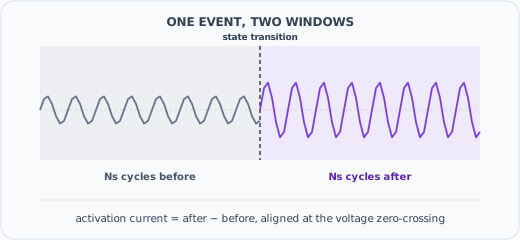
Every feature in this chapter starts from the same raw material: a short window of current and voltage, centered on the moment an appliance changed state. Getting that window right matters as much as anything downstream of it. The recipe, unchanged across the WRG, AWRG, and phase-imbalance work, is to measure \(N_s\) complete mains cycles immediately before the transition, \(\{\mathbf{i}^{(b)}, \mathbf{v}^{(b)}\}\), and \(N_s\) cycles immediately after, \(\{\mathbf{i}^{(a)}, \mathbf{v}^{(a)}\}\) [1]. For three-phase industrial data each phase gets its own before-and-after pair; for single-phase residential data there is only one [2].
Both windows are aligned at the voltage’s zero-crossing before anything else happens to them, and that alignment is not a formality. An AC waveform’s instantaneous value depends on exactly where in the cycle it is sampled, so comparing a before-window and an after-window that start at different phase angles would pick up a difference caused by phase misalignment, not by the appliance. Zero-crossing alignment pins both windows to the same starting phase, so a point-by-point subtraction reflects only what actually changed. Because current also adds linearly, that subtraction is enough on its own to cancel out everything that did not change and leave only the appliance that just switched: \(\mathbf{i} = \mathbf{i}^{(a)} - \mathbf{i}^{(b)}\) for a switch-on event, or the reverse for a switch-off [1], [2]. \(N_s\) itself is not universal: 20 cycles for the sub-metered single-appliance data the original WRG paper used, 2 cycles for aggregated PLAID (following the convention in [3]), and 10 to 25 cycles for the three-phase LILACD data, chosen empirically once the industrial signal turned out to need a longer window to settle [1], [2], [4].
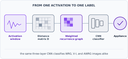
The resulting window is still \(T_s = f_s / f\) samples long, tens of thousands of samples at PLAID’s 30 kHz. Piecewise Aggregate Approximation (PAA) reduces it to a fixed, much smaller size \(w\) by averaging each of \(w\) equal segments down to one value, which is what actually feeds the distance matrix below. Figure 5.1 walks through the extraction step; Figure 5.2 picks up immediately after, once that fixed-size window exists.
Key Concept
Take that activation current, reduced to \(w\) points \(\mathbf{x} = \{x_1, \ldots, x_w\}\). The distance similarity matrix \(D_{w \times w} = [d_{k,j}]\) records how far apart every pair of points in that window is:
\[ d_{k,j} = |x_k - x_j| \]
\(D\) says nothing about appliances by itself. It is a structural fingerprint of the waveform’s own shape: a smooth periodic signal produces one pattern, a spiky transient produces another. The rest of this chapter is about what to do with \(D\) once it exists [1].
The notebook below builds \(D\) for a single, real activation current from PLAID, already extracted the way Figure 5.1 describes. The same event can be read two ways at once: current against time, on the left, or current against voltage, on the right.
The other route: the V-I trajectory
Chapter 1 named the voltage-current (V-I) trajectory as a high-frequency signature: the closed loop traced by plotting instantaneous voltage against instantaneous current over one cycle. The right-hand panel above, the same activation current plotted against its own voltage instead of against time, is that loop.
A resistive appliance traces something close to a straight line; a motor or a switch-mode power supply bends that line into a loop with a distinctive shape. That shape is a real, usable feature on its own, and it is the one most of the appliance-classification literature reached for first [3], [5]. To make it a fixed-size input a classifier can consume, the loop is meshed onto a \(w \times w\) grid and rasterized into a binary V-I image, the same way a raw current window gets reduced to \(D\) above. That V-I image is the baseline this chapter measures WRG against for the rest of the way.
From a distance matrix to a recurrence graph
The standard way to turn \(D\) into an image, borrowed from nonlinear time-series analysis, is the recurrence plot: pick a threshold \(\epsilon\) and mark two points as “recurring” whenever they are closer than that threshold [6]. Formally, the recurrence graph \(RG_{w \times w} = [r_{k,j}]\) is the binary matrix
\[ r_{k,j} = \begin{cases} 1 & \text{if } d_{k,j} \geq \epsilon \\ 0 & \text{otherwise} \end{cases} \]
\(RG\) can be read as an unweighted graph: \(r_{k,j}\) is the adjacency matrix between points in time, and the resulting image gives a classifier something to learn from beyond the raw waveform [1]. But binarizing \(D\) at a single threshold throws away everything except a yes/no answer at every pixel. Two activations that are close but not identical, and two that are worlds apart, can end up looking the same once thresholded.
Weighted recurrence graphs
The fix is to stop throwing that detail away. Instead of collapsing \(D\) to 0 or 1, the weighted recurrence graph (WRG) keeps a graded value, capped at a maximum \(\delta\):
\[ r_{k,j} = \min\left(\left\lfloor \frac{d_{k,j}}{\epsilon} \right\rfloor, \delta\right) \]
Reparametrizing \(\lambda = 1/\epsilon\) for numerical stability, \(r_{k,j} = \min(\lfloor d_{k,j} \cdot \lambda \rfloor, \delta)\). Setting \(\delta = 1\) recovers the binary \(RG\) above; \(\lambda\) and \(\delta\) are hyperparameters, tuned once and then fixed [1]. The resulting \(WRG_{w \times w}\) image, together with the V-I image introduced above, is what a small three-layer CNN classifies.
The panels above make the earlier claim concrete: the weighted version keeps gradations the binary version collapses to a single color. On real datasets, that difference is not cosmetic. Moving from binary \(RG\) to \(WRG\) raises macro \(F_1\) from 98.96% to 99.86% on the COOLL dataset and from 88.18% to 94.35% on PLAID [1], [7], [8]. Against the V-I image baseline, evaluated with leave-one-house-out cross-validation so the comparison reflects generalization to a house the model never trained on, \(WRG\) wins by 0.92, 8.5, and 4.5 percentage points of macro \(F_1\) on COOLL, WHITED, and PLAID respectively [1], [3], [9], [10].
Making the hyperparameters learnable: AWRG
\(\lambda\) and \(\delta\) still have to be chosen somehow, and hand-tuning two hyperparameters per dataset does not scale. The adaptive weighted recurrence graph (AWRG) treats them the same way a neural network treats its own weights: as parameters learned by gradient descent, initialized once and then updated during training rather than fixed in advance [2]. The block that does this is only two lines: floor the scaled distance, then clip it to the learned ceiling. On aggregated, multi-appliance PLAID and on the three-phase LILACD dataset, initializing both parameters near 10 gives the fastest, most stable convergence; initializing at zero stalls training outright, because the gradient has nothing to push against. AWRG lifts PLAID from 0.91 to 0.98 on the Matthews correlation coefficient (MCC, a single balanced accuracy score that tops out at 1.0), cutting misclassifications from 8.32% to 2.23%, and lifts LILACD from 0.85 to 0.98 MCC (13.82% down to 1.66%), both against the same V-I baseline [2], [11].
Reproducing the residential result
Every number in that last paragraph is cited from the AWRG paper’s own experiments. Before trusting them, it is worth training a fresh classifier on data neither those experiments nor this book has touched yet: PLAID 2020, a newer release of the same residential dataset with 2,092 real aggregated activation events across 12 household appliances [12]. Same recipe as the WRG-vs-V-I comparison above, applied to a full dataset instead of one activation, evaluated on a held-out 25%.
Before training that classifier, the same separability check from the LILACD section is worth running here too: a deliberately mixed set of six residential appliances, three of V-I’s worst performers (blender, coffee maker, fridge) and three of its best (hair iron, CFL, water kettle).
Same pattern as LILACD: V-I’s six clusters overlap heavily, WRG’s mostly pull apart. That is what the trained classifier confirms next.
The residential story holds on fresh data: V-I tops out at 60.4% macro \(F_1\); WRG reaches 81.2%, a 21-point jump from swapping one feature representation for another with nothing else changed. Which appliances carry that gap?
V-I’s worst scores land on appliances whose current barely varies from one sample to the next: a blender (26%), a coffee maker (30%), a fridge (34%). WRG recovers most of them outright, the coffee maker jumps to 98%, but not all of them. The fridge barely moves, 34% to 38%, a reminder that WRG fixes the specific confusion caused by a flat current shape, not every source of appliance ambiguity. The confusion matrix shows exactly where that specific failure lands.
The single biggest confusion is a fridge called an air conditioner (15 of this test split’s mistakes), followed by an air conditioner called an incandescent bulb (12) and a fridge called a fridge defroster (8). The first and third make sense, a fridge, an air conditioner, and a fridge defroster are all compressor-driven appliances with a similarly gradual current draw, not the sharp, resistive signature WRG is best at telling apart. The second is a genuine open question this run doesn’t resolve.
The panels above are the literal WRG image behind that top confusion: a real held-out fridge activation the model called an air conditioner, next to a real, correctly classified air conditioner. Two compressor motors, photographed by the same feature, look almost the same.
How much do the hyperparameters actually matter?
\(\lambda\) and \(\delta\) still have to be chosen somehow, and the AWRG paper’s own grid search found performance swinging widely across both, with zero initialization stalling training outright. Running that same sweep on PLAID 2020 turns that claim into a picture.
Both curves peak in the middle and fall off at either extreme. \(\lambda\) climbs from 50.3% macro \(F_1\) at \(\lambda=1\) to 81.6% at \(\lambda=10\), then slides back to 76.8% by \(\lambda=50\): too small and the distance matrix barely gets thresholded at all, too large and every cell saturates to the ceiling. \(\delta=1\), the binary recurrence graph, tops out at 52.4%; letting \(\delta\) grow to 20 recovers WRG’s full 81.6%, then overshooting to \(\delta=50\) gives back some of that gain. Neither curve has an obvious “just set it high” or “just set it low” answer, which is exactly the situation AWRG’s learned parameters exist to avoid.
The embedding size \(w\) has a different shape entirely.
Tripling \(w\) from 30 to 80 buys 6.9 points of macro \(F_1\) (77.5% to 84.4%) while nearly quadrupling training time (14 seconds to 51). Past a point, spending more \(w\) buys far less accuracy than it costs in training time, precisely the tradeoff the Common Mistake box near the end of this chapter warns about.
Extending to industrial, three-phase settings
Which brings the chapter back to the bulb. Industrial sites mix large three-phase machinery with ordinary single-phase appliances, and real three-phase power is rarely perfectly balanced across all three lines [13]. When a small appliance shares a line with a large, unbalanced load, its activation current comes out distorted, and WRG built directly on that raw current inherits the distortion.
The tool for pulling the small signal back out is the Fortescue transform, a long-standing technique for decomposing an unbalanced three-phase system into three components: positive-sequence, negative-sequence, and zero-sequence. For a perfectly balanced three-phase system, the zero-sequence component is exactly zero. So whatever zero-sequence current does show up is, by construction, a direct measure of the imbalance itself, which is exactly where a single-phase appliance’s own signature tends to concentrate once it is sharing a line with something much larger [4]. The panels below put both sides of that fix side by side: a real LILACD bulb’s raw three-phase current, one phase carrying the load and the other two carrying almost nothing, next to the same event after the transform, where the zero-sequence component alone carries the bulb’s signature.
Applying the Fortescue transform before building the recurrence graph, then classifying with the same architecture as before, raises the combined-phase \(F_1\) score on LILACD from 94.21% without the transform to 96.43% with it. The V-I baseline fares far worse under imbalance: below 60% \(F_1\) for resistive single-phase appliances like the coffee machine, kettle, and raclette, precisely the appliances most likely to sit on a line with a large motor [4], [11].
Training and evaluating the classifier
Every number so far has been cited from the papers. This section trains a real classifier instead, on the full LILACD dataset: all 16 appliance types at once, three phases stacked as three input channels. The architecture is the same small three-layer CNN described earlier. The only thing that changes between runs is which image representation feeds it: V-I, WRG, or WRG with the Fortescue transform applied first. Following the same protocol as the AWRG paper, the model trains on a stratified 75% of the data and is evaluated on the untouched remaining 25% [2].
Before training that classifier, it is worth checking whether the features feeding it even separate appliances in the first place, with no model in the loop yet. The plot below runs t-SNE on the raw V-I and WRG feature vectors for six LILACD appliances chosen to mix single-phase and three-phase loads: a bulb, two resistive heaters this section later shows the classifier confusing, a single-phase motor, and two three-phase industrial machines.
Under V-I, the six appliances’ clusters overlap heavily; under WRG, most of them pull apart, the two three-phase machines especially, since a large motor’s activation current has almost nothing in common with a bulb’s or a heater’s once WRG turns it into a graph instead of a loop. That is what the numbers below confirm with an actual trained classifier instead of an unsupervised projection.
This notebook’s own run is smaller and faster than the published experiments: 40 training iterations on a single split, not 600 iterations across a 4-fold cross-validation. Treat the exact numbers as a live sanity check, not a reproduction of the paper’s headline scores. The ranking still comes out the same way: V-I trails badly (macro \(F_1\) 48.2%), WRG is a large step up (88.2%), and adding the Fortescue transform improves it further still (92.6%), the same ordering reported at full scale above. Which appliances specifically?
V-I’s worst scores are near-total failures on single-phase resistive loads: 0% on both Kettle and Hair-dryer, 14% on Coffee-machine, 18% on Raclette, all four are simple heating elements whose current shape carries almost no distinguishing detail as a V-I loop. WRG recovers Kettle and Coffee-machine completely (both reach 100%) and lifts Raclette to 73%, but Hair-dryer stays stuck at 0% until the Fortescue transform is added, at which point it jumps to 77%. WRG+FT is not a uniform upgrade over WRG alone, though: Coffee-machine actually drops from 100% to 84%, and Raclette from 73% to 68%. The net effect across all 16 appliances is still a gain (88.2% to 92.6% macro \(F_1\)), but it is not every appliance winning; it is Hair-dryer’s large gain outweighing two smaller losses elsewhere.
The confusion matrix shows where the WRG+FT model still struggles, and it is not random. In this run, Raclette gets mistaken for Coffee-machine more than any other pair, both are simple resistive heating elements with similar current shapes, and a smaller Hair-dryer/Raclette confusion survives too. That second pair is the same one the FT paper itself calls out: without the transform, RG confuses Hair-dryer and Raclette repeatedly; FT does not erase that confusion, it only shrinks it [4]. Fixing what is left would need a feature that distinguishes resistive loads by something other than current magnitude, not a bigger version of the same image.
That top confusion is not an abstraction. The panels above are the literal WRG+FT image behind one real held-out mistake: an actual Raclette activation the model called a Coffee-machine, next to an actual, correctly classified Coffee-machine. Placed side by side, the reason for the mix-up stops being a sentence about “similar resistive heating elements” and becomes a fact about two pictures that look almost the same.
Why bother
None of this is only a classification exercise. Recognizing that an activation came from “Motor #3” is a means, not the point. What actually pays for the sensor is what that signature reveals about the shape of the current a machine draws, cycle after cycle, and whether that shape is drifting.
A bearing wearing down, a rotor bar cracking, a winding starting to degrade: all of these distort a motor’s own current draw first, well before the vibration, heat, or noise a technician would notice on a walk through. That is the same physical fact this whole chapter has been built on: current carries an appliance’s identity in its shape, not just its magnitude. Nothing about that fact stops being true once an appliance is correctly classified. The WRG image built to answer “which machine is this” is the same object that can answer “does this machine still look like itself.” Comparing a motor’s own recurrence graph against its healthy baseline, month over month, is the identical distance-similarity computation this chapter opened with, run against the machine’s own past instead of against other appliance classes.
That reframing is what makes this worth building beyond a labeling exercise. An industrial site that already runs this feature pipeline for appliance recognition gets equipment health monitoring for free: no vibration sensor, no thermal camera, no extra hardware per machine, just the same aggregate current measurement, phase imbalance and all, read a second way. Catching a large motor’s changing signature while it is still running, instead of after it stops, is the same value proposition Chapter 1 introduced for a household fridge, now scaled to equipment where an unplanned outage is measured in downtime and lost production, not spoiled food [4].
Where this part of the book goes
This chapter treated every event as caused by exactly one appliance changing state. Real aggregate signals rarely cooperate:
- Chapter 3, multi-appliance recognition, extends this same graph-based representation to the more realistic case where several appliances change state at once, all captured in the same activation window.
- Chapter 4, deep learning at low frequency, moves off event-based, high-frequency features entirely, onto the energy-estimation side of NILM introduced in Chapter 1.
Common Mistake
Assuming a larger embedding size \(w\) always helps. Past a certain resolution, a bigger \(WRG\) image stops paying for itself: this chapter’s own sweep found tripling \(w\) from 30 to 80 worth only 6.9 points of macro \(F_1\) for nearly quadruple the training time. Too small a \(w\), on the other hand, genuinely loses information. The right size is found empirically, once, not maximized by default.